Styling Initials
In many layouts, the first letter of a text (the initial) is styled in a different way, such as making it much larger and/or of a different color.
While it is possible to build such a layout “by hand”, there is a special feature in pagestrip to make this not only easier, but also ensure that the editor knows about the semantic significance of the design. This way, it is possible to also render the initials in a sensible manner in other contexts, such as the mobile view.
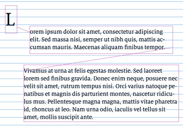
To build a text with a specially styled initial, start by creating two (or three) connected text boxes, then fill them with text.
Next, choose the first box in the chain and select Text Initials mode in the Options pane of the text inspector.
With the setting applied, only a single letter (at maximum) will be rendered in the given text box. You can then style and position the letter whichever way you want.
You can also change multiple boxes with text initals mode together, if you want to create initials consisting of multiple letters.
For additional clarity, here’s a picture of how the connected text boxes are set up in the previous screenshot. As you can see, these are just three boxes positioned in a way to line up nicely on the grid.
By setting up text initials in this way, you can also use additional settings in the mobile way, in order to ensure that your initials render nicely on smartphones as well. You can create floating initials for mobile, and adjust both horizontal and vertical spacing to your liking.
To access these settings when styling the mobile view of a story, refer to the “Extra Text Settings” inspector pane after selecting a text with an initial.
Text initials in mobile view will also scale according to the screen size, much like any other text.
Need more help? Please let us know!